
The Numbers That Actually Tell Your Community's Story & Success.....
How to build a data-driven community as a community manager!

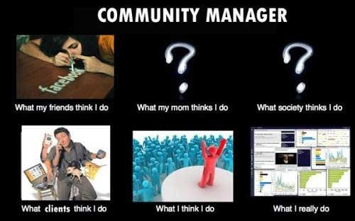
Why Data Matters (Even If You Hate Spreadsheets) ‼️
Hiyaaaaa, if you’re new here (welcome! 🎉) and to the oldies, welcome back to The Community Manager Guide — your weekly dose of practical frameworks, stories, and strategies to build profitable and sustainable communities.
Now let’s get into this week’s big one ⬇️
If there’s anything I’ve noticed, it’s that most of us haven’t really mastered the art of tracking our community growth — the engagement, the numbers, the real impact.
Three weeks ago, I got a voice note from Sarah, a community manager who runs a 2,000-member WhatsApp group for female entrepreneurs in Lagos.
She said, “My boss keeps asking, ‘How’s the community doing?’ And honestly… I don’t know what to tell her.”
“What do you mean?” I asked.
“I know it’s good. People are talking, helping each other, sharing wins — but I can’t prove it outside of the screenshot with detailed numbers.”
And the truth is, Sarah is not alone tbh. So many of us are doing incredible work building communities — but when it’s time to show results, we don’t have actual data to back it up.
And it’s because most of us community managers are building incredible spaces — spaces where real connection happens, where problems get solved, where members genuinely support each other.
But we have no idea how to measure it.
So when their boss asks “Is this working?” or when they need to justify budget or resources, they freeze.
Because follower count doesn’t capture the vibe. Message volume doesn’t show impact. And “it just feels good” doesn’t hold up in a boardroom.
This week, I want to solve that problem for in m own little way, someone say Kishi for PRESIDENT.
I’m going to show you exactly what data to track, how to track it (even on WhatsApp or Telegram), and—most importantly—how to turn that data into a story that proves your community’s value.
Why Data Matters (Even If You Hate Spreadsheets)
Let me start with the uncomfortable truth: If you can’t measure it, you can’t improve it. And if you can’t prove it, you can’t REPLICATE it.
Quantitative data metrics combined with qualitative data—quotes from members and member stories—are your tools to share the narrative of your community with stakeholders.
Translation: Numbers + stories = credibility.
Without data, you’re vulnerable. When budget cuts come, when priorities shift, when someone questions whether the community is “worth it”—you have nothing to defend yourself with except “trust me, it’s working.”
That’s not enough.
But here’s the thing: I’m not asking you to become a data scientist. I’m not asking you to build complex dashboards or run regression analyses.
I’m asking you to track the numbers that actually matter. The ones that tell the real story of your community’s health, growth, and impact.
And spoiler alert: Most of the metrics community managers obsess over? They don’t matter at all.
The Metrics Nobody Needs (But Everyone Tracks)
Before we talk about what to measure, let’s clear out the noise.
Here are the metrics that feel important but tell you almost nothing:
❌ Total Member Count
“We grew from 800 to 1,200 members this quarter!”
Cool. But how many of those 1,200 are actually active?
How many have ever contributed anything?
How many would notice if the community disappeared tomorrow?
“If you want to look at the impact an event has, the number of attendees isn’t going to cut it. You want to know, did people get something out of it? Did it help them?”
Follower count is a vanity metric. It makes you feel good, but it doesn’t tell you if your community is healthy.
❌ Total Messages Sent
“We had 450 messages this month!”
Great. But were those messages 10 people having a conversation, or 450 people each posting once and leaving? Were they meaningful exchanges, or just “good morning” spam?
Volume doesn’t equal value.
❌ Post Reach or Impressions
This one’s especially deceptive on platforms with built-in analytics.
“Our last post reached 5,000 people!”
But how many of those 5,000 actually read it? How many cared? How many took action?
Reach is a broadcasting metric, not a community metric.
High engagement rates might not always indicate positive engagement—they could also signify conflicts or spam posts. Data must not be looked at in a vacuum.
So if those metrics don’t matter... what does?
The Two Types of Data That Actually Tell Your Story
Here’s the data process I think we should start focusing on more:
Every meaningful community metric falls into one of two categories:
- Quantitative or Qualitative.
And you need BOTH to understand your community’s health and growth.
A quantitative community engagement measure was developed with 96 Likert response items; 3-5 quality items and 3-5 quantity items measure each engagement principle. Every item group had a Cronbach’s alpha > .85, indicating strong internal consistency.
Translation: Quality and quantity are equally important—and they validate each other.
Let me break down what that means for you in basic language:
Quantitative Data: The “What” and “How Many”
These are the hard numbers. The metrics you can count, track over time, and put in a spreadsheet.
Quantitative metrics include engagement rates (likes, comments, shares, and overall participation), activity levels (frequency of posts, threads, or other interactions), and retention rate (how long members stay active within the community).
Examples:
How many members are active each week?
How many conversations are happening?
How long do members stay in the community?
How many people attend events?
How quickly do questions get answered?
Quantitative data tells you IF something is happening and how much of it is happening.
But it doesn’t tell you WHY. Or whether it’s actually valuable.
That’s where qualitative data comes in.
Qualitative Data: The “Why” and “How It Feels”
These are the stories. The feelings. The human experiences that numbers can’t capture.
Qualitative metrics are more subjective and based on the quality of experiences and interactions within the community. They require deeper analysis and often involve gathering feedback directly from members.
Examples:
What are members saying about their experience?
How do they feel about the community?
What problems are getting solved?
What relationships are forming?
What stories are they telling about the value they’re getting?
While quantitative data like survey response rates and participation numbers are valuable, they don’t tell the whole story. To truly understand the effectiveness of your community engagement efforts, it’s essential to consider qualitative aspects as well.
Qualitative data tells you WHY it matters and what impact it’s having.
When you combine both, you get a complete picture.
Quantitative data gives you credibility (”Here are the numbers”). Qualitative data gives you emotion (”Here’s what it means to real people”).
Together? They’re unstoppable.
Let me show you how this works in practice.
The Essential Quantitative Metrics (And How to Track Them)
Alright, let’s get practical. Here are the quantitative metrics every community manager should track—regardless of your platform or audience size.
1. Active Member Rate (Not Total Members)
What it is: The percentage of your total members who actually engage in a given period.
Why it matters: This tells you if you have a real community or just a database of names.
How to calculate:
Active Members (who posted/commented/reacted in last 30 days) ÷ Total Members × 100 = Active Member Rate %What’s good:
20-30% = Decent for large communities (500+)
40-60% = Strong for medium communities (100-500)
60-80% = Excellent for small, tight-knit communities (<100)
How to track it:
On WhatsApp/Telegram: Tools like KYG (Know Your Group) provide comprehensive analytics for Telegram including tracking active and inactive members, message interactions, and engagement patterns.
For WhatsApp, you can use:
WHAMetrics for advanced WhatsApp group analytics, statistics, engagement tracking, and trends
Manual tracking: Export chat, count unique contributors monthly
On Discord/Slack:
Built-in analytics show daily/weekly/monthly active users
Use bots like MEE6 (Discord) or Statsbot (Slack) for deeper insights
On platforms like Circle, Mighty Networks:
Dashboard analytics show active vs. total members automatically
Pro tip: Track this monthly. If your active rate is dropping over time, your community is dying—even if total members are growing.
2. Member-to-Member Engagement Rate
What it is: The percentage of conversations that happen between members (not involving you).
Why it matters: Qualitative insights like member feedback and anecdotal evidence fill in gaps that quantitative data leaves, offering a fuller picture. If you’re the center of every conversation, you don’t have a community—you have an audience.
How to calculate:
Conversations without CM involvement ÷ Total Conversations × 100 = Member-to-Member Engagement %What’s good:
40-50% = Minimum healthy threshold
60-70% = Strong community ownership
80%+ = Self-sustaining community
How to track it:
On WhatsApp/Telegram: Analyze message interactions to see which members make the most contributions and identify inactive participants
Manually: Review last 50 messages. How many were replies to OTHER members vs. replies to YOU?
On Discord/Slack:
Look at threaded conversations
Track @mentions: How many are tagging each other vs. tagging you?
On forums/platforms:
Most platforms show “thread starter” vs. “participants”
Track who’s responding to whom
Pro tip: If this number is below 40%, you need to intentionally create spaces for peer-to-peer interaction. Launch peer help channels, mentorship pairings, or member-led discussions.
3. Average Response Time (For Questions/Help Requests)
What it is: How long it takes for a member’s question to get answered.
Why it matters: Fast responses = members feel supported. Slow responses = members give up and leave.
How to calculate:
Time between question posted and first helpful response = Average Response TimeWhat’s good:
< 2 hours = Excellent (highly responsive community)
2-6 hours = Good
6-24 hours = Acceptable
24+ hours = Problem (members losing faith)
How to track it:
On any platform:
Sample 20 recent questions
Note timestamp of question and timestamp of first answer
Calculate average
Udacity runs numerous Telegram groups for students and implements analytics to track engagement, identify active and inactive students, and analyze questions being asked. This allows them to help struggling students solve problems and provide timely help.
Tools:
Combot for Telegram tracks user activity, most active participants, and can monitor response times in group chats
For WhatsApp, manual tracking or WHAMetrics
Pro tip: If response time is slow, recruit “community helpers”—power users who get recognition for answering questions quickly.
4. Retention Rate (How Long Members Stay)
What it is: The percentage of members who are still active after a set period (30 days, 90 days, 6 months).
Why it matters: If people join and leave quickly, your onboarding or engagement strategy is broken.
How to calculate:
Members still active 90 days after joining ÷ Total members who joined 90 days ago × 100 = 90-Day Retention RateWhat’s good:
60-70% at 30 days = Strong onboarding
50-60% at 90 days = Healthy engagement
40%+ at 6 months = Long-term stickiness
How to track it:
On any platform:
Tag members with their join date
Check activity 30/90/180 days later
Calculate percentage still active
Tools:
TGStat and Telemetr provide detailed subscriber growth dynamics and can track retention over time for Telegram channels
Most community platforms (Circle, Hivebrite, etc.) have retention analytics built in
Pro tip: If 30-day retention is low, fix your onboarding. If 90-day retention is low, you need better rituals and progression paths.
5. Event Attendance Rate (And Repeat Attendance)
What it is: Percentage of members who attend your events, and how many attend multiple events.
Why it matters: Events are community-building moments. Low attendance = low engagement. High repeat attendance = strong belonging.
How to calculate:
Event Attendees ÷ Total Members = Attendance Rate

Attended 2+ Events ÷ Total Attendees = Repeat Attendance Rate
What’s good:
15-25% attendance = Decent for large communities
30-50% attendance = Strong for medium communities
50%+ attendance = Excellent (small or highly engaged)
40%+ repeat attendance = Your events are valuable
Track joining rate (how many initially show interest), participation rate (how actively they engage), and completion rate for cohort-based programs, workshops, seminars, and events.
How to track it:
On Zoom/Google Meet:
Export attendee list
Compare to member roster
Track names across multiple events
On WhatsApp/Telegram:
Create event-specific polls or RSVP messages
Track who confirms and who actually shows up
Tools:
Eventbrite or Luma for event RSVPs + attendance tracking
Google Analytics with UTM parameters can track event registration and attendance when linked from community messages
Pro tip: If attendance is low, your event timing, format, or topic might not be off, I’ve realized people just have a mind of their own lol but then the goal is to optimize for more attendees and not just registered participants.
Survey members: “What would make you more likely to attend?”
6. Content Contribution Rate
What it is: Percentage of members who create content (posts, resources, guides, etc.) vs. just consume.
Why it matters: Contributors are your most invested members. They drive the community forward.
How to calculate:
Members who posted original content in last 30 days ÷ Total Active Members × 100 = Contribution RateWhat’s good:
10-20% = Healthy (most communities follow 90-9-1 rule)
20-30% = Strong contributor culture
30%+ = Exceptional co-creation
How to track it:
On any platform:
Count unique posters who initiated threads/content
Divide by total active members
Pro tip: If contribution rate is low, create specific prompts: “Share your story Fridays” or “Template Tuesdays” where members contribute resources.
The Essential Qualitative Metrics (The Stories That Matter)
Now let’s talk about the data you can’t put in a spreadsheet—but that’s often MORE powerful than numbers.
“Our work is always going to be relationship-based. Community testimonials, member comments, and conversations with community members are the true barometers of success.”
1. Member Testimonials & Success Stories
What it is: Direct quotes from members about how the community has helped them.
Why it matters: One powerful testimonial is worth more than 100 statistics. It puts a human face on your impact.
How to collect it:
Post-event surveys: “What was most valuable about today’s session?”
Monthly check-ins: DM active members: “How has the community helped you this month?”
Celebration prompts: “Share a win the community helped you achieve!”
Exit interviews: When someone leaves, ask: “What did you get out of being here?”
How to track it:
Establish a central place for you and your staff to drop anecdotes and quotes from members so that when it’s time to report to stakeholders, you have them ready.
Create a simple Google Sheet or Notion page with columns:
Date
Member Name
Quote/Story
Context (what triggered it—event, conversation, milestone)
Impact (what outcome it shows)
Pro tip: Aim to collect 2-3 testimonials per month. When you report to stakeholders, pair every quantitative metric with a real story.
Example:
“We had 73% member-to-member engagement this quarter. Here’s what that looks like in practice: Sarah connected with Tunde through our peer mentorship program. He helped her land her first client. She told me: ‘I came here feeling alone. Now I have a business partner and three new friends.’”
That’s the combo punch.
2. Sentiment Analysis (How Do Members Feel?)
What it is: The overall tone and emotion in your community conversations.
Why it matters: Sentiment captures the overall mood or tone within the community, often gauged through sentiment analysis. Data can be misinterpreted without proper context. You can have high activity but negative sentiment (conflict, complaints). Or low activity but positive sentiment (small, supportive).
How to assess it:
Manual method:
Review last 50 messages/posts
Tag each as Positive, Neutral, or Negative
Calculate percentages
What’s healthy:
60%+ Positive
30% Neutral
<10% Negative
Tool-assisted:
TGStat offers sentiment analysis features for Telegram channels and groups
AI tools like Go Vocal’s Sensemaking module can identify patterns and extract meaningful information from large datasets to quickly grasp sentiment
Key questions to ask:
Are people helping each other or arguing?
Are conversations solution-focused or complaint-focused?
Do members use language like “we” and “us”? (Belonging indicator)
Pro tip: If sentiment is declining, intervene immediately. Address conflicts publicly, celebrate wins more visibly, and inject positivity through intentional prompts.
3. Depth of Relationships Formed
What it is: Evidence that members are forming genuine connections beyond surface-level interaction and this might not be relevant or applicable to most communities but if it’s part of our community objectives then TRACK IT.
Why it matters: This is the difference between a transactional space and a real community and should be tracked in the community itself or via a monthly newsletter survey if you have any and can also be very useful in communities with accountability buddies and all.
What to look for:
Friendships forming: Members DMing each other, meeting offline, collaborating
Mutual support: Members checking in on each other during hard times
Inside jokes/shared language: Community develops its own culture and references
Organic gatherings: Members organize meetups or projects without your involvement
How to track it:
Ask directly:
“Have you formed any friendships or network through this community?”
“Have you connected with anyone outside the main channel?”
“Would you stay in touch with community members if the group disappeared?”
Smart metrics connect community engagement to organizational goals. Look at qualitative touchpoints like the number of conversations and long-lasting connections.
Pro tip: Create a “Connection Report” section in your tracking sheet. Note every time you observe:
Members collaborating on a project
Someone mentioning they met up with another member
Inside jokes or recurring cultural moments
These are your proof points that real community exists.
4. Problem-Solving Capacity
What it is: Evidence that your community solves real problems for members.
Why it matters: Community impact goes beyond attendance numbers. You want to know: did people get something out of it? Did it help them?
What to look for:
Questions getting answered (and by whom—you or members?)
Resources being shared (templates, contacts, advice)
Tangible outcomes: “I got a client through this community,” “Someone here helped me fix my website,” “I learned how to price my services here”
How to track it:
Weekly audit:
Count questions asked
Count questions answered (and by whom)
Document specific outcomes members report
Example tracking:
“This week: 12 questions asked, 11 answered (9 by members, 2 by me). Outcomes: Chioma found a designer through the community, James got feedback that helped him close a deal.”
Pro tip: Celebrate problem-solving publicly. When someone gets help, amplify it: “Shoutout to @Member for helping @NewMember solve X!” This encourages more peer support.
5. Member Satisfaction (NPS)
What it is: Net Promoter Score—would members recommend your community?
Why it matters: This single question predicts retention and word-of-mouth growth.
How to measure:
Ask quarterly:
“On a scale of 0-10, how likely are you to recommend this community to a friend?”
How to calculate NPS:
% Promoters (9-10) - % Detractors (0-6) = NPS ScoreWhat’s good:
50+ = Excellent
30-50 = Good
10-30 = Room for improvement
<10 = Crisis
Net Promoter Scores should be tracked as one of the key metrics alongside member lifetime, survey response rates, and member referrals to measure engagement depth.
How to track it:
Use Google Forms, Typeform, or Tally for surveys
Send quarterly via DM or post in community
Track scores over time
Pro tip: Always ask “Why?” after the rating. The reasons tell you what to fix or double down on.
When to Track What: The Community Manager’s Measurement Calendar
You don’t need to track everything all the time. Here’s when to measure what:
Daily (Quick Pulse Checks)
Scan sentiment (are conversations positive?)
Note any standout testimonials or stories
Check response time on new questions
Time investment: 10 minutes
Weekly (Activity Monitoring)
Active member count this week
Member-to-member engagement rate
Event attendance (if you hosted one)
Document 1-2 success stories
Time investment: 30 minutes
Monthly (Deep Dive)
Calculate all quantitative metrics
Review qualitative data collected
Update tracking spreadsheet
Create summary for stakeholders
Time investment: 2 hours
Quarterly (Strategic Assessment)
Run NPS survey
Analyze retention trends
Compare quarter-over-quarter growth
Adjust strategy based on what’s working/not working
Time investment: 3-4 hours
The Tools You Actually Need (Platform-Specific)
Let me break down exactly what tools to use based on where your community lives:
For WhatsApp Communities:
WHAMetrics provides WhatsApp and Telegram analytics, statistics, automation, group management, and sync capabilities
Free options:
Manual tracking (export chat, count manually)
Google Sheets for logging testimonials and stories
Paid tools ($10-50/month):
WHAMetrics (analytics + automation)
Google Analytics with UTM parameters for tracking traffic from WhatsApp links
For Telegram Communities:
KYG (Know Your Group) is a comprehensive tool with analytics for subscriber growth and monetization, including a community health index, member onboarding tools, and personalized recommendations
Free options:
Telegram’s built-in channel analytics (for channels)
Analytic Bot provides basic analytics about channel performance including subscriber growth and post engagement
Paid tools ($15-100/month):
TGStat offers comprehensive analytics for channels and groups including member growth, engagement, and content performance with user-friendly dashboard
Combot for managing groups with chat moderation, audience analytics tracking user activity and engagement metrics
Telemetr for detailed analytics on channel performance, audience demographics, and competitive analysis
For Slack/Discord:
Built-in analytics:
Slack: Workspace analytics (paid plans)
Discord: Server Insights (built-in for communities with 500+ members)
Bots (free/freemium):
MEE6 (Discord) - engagement tracking, leaderboards
Statsbot (Slack) - activity reports
Community Hubs (Discord) - cross-server analytics

For Dedicated Community Platforms:
Circle, Mighty Networks, Hivebrite, Skool:
All have built-in analytics dashboards
Track active members, engagement, posts, events automatically
Hivebrite users have access to a powerful suite of community analytics tools that track activity and engagement metrics for generating reports on member activity
No additional tools needed — but still manually track qualitative data (testimonials, stories) separately.
Universal Tools (Work Everywhere):
For surveys:
Google Forms (free)
Typeform (paid, beautiful UX)
Tally (free, great features)
For tracking/reporting:
Google Sheets (free) - Download free community metrics template here
Notion (free for personal use)
Airtable (free for small datasets)
For sentiment analysis:
AI tools like Go Vocal’s Sensemaking module can identify patterns and extract meaningful information from large datasets
Manual review (often more accurate for small communities)
How to Actually Use This Data (The Reporting Framework)
Collecting data is useless if you don’t know what to do with it.
Here’s how to turn your data into action:
Monthly Report Structure (For Yourself)
1. Health Check (Quantitative)
Active member rate: X% (↑ or ↓ from last month)
Member-to-member engagement: X%
Average response time: X hours
Event attendance: X%
2. Community Vibe (Qualitative)
Overall sentiment: Positive/Neutral/Concerning
2-3 standout testimonials
Notable problems solved
Relationships/collaborations formed
3. What’s Working
[Specific initiative] drove X% increase in [metric]
Example: “Friday Wins thread increased engagement 30%”
4. What Needs Attention
[Specific problem] is causing [specific metric] to decline
Example: “Retention at 90 days dropped to 40%. Need better rituals.”
5. Next Month’s Focus
One priority based on data
Quarterly Report (For Stakeholders)
1. Community Impact at a Glance
X active members (X% growth)
X conversations facilitated
X problems solved
X events hosted with X total attendees
2. Member Success Stories
3-5 powerful testimonials with names/photos (if permitted)
Specific outcomes: “12 members found clients through the community”
3. Community Health Trends
Charts showing growth in key metrics
Sentiment over time
Retention curve
4. Business Impact (if applicable)
How community engagement correlates with retention, sales, referrals
Example: “Members who engage in community have 2X higher renewal rate”
5. Next Quarter Strategy
Based on data, here’s what we’re doubling down on
Here’s what we’re experimenting with
Here’s what we’re sunsetting
The One Thing You Must Track (If You Track Nothing Else)
If all of this feels overwhelming or it’s just too much to do for you, at least start with ONE metric:
Member-to-member engagement rate.
Because this single number tells you if you have a real community or just an audience.
If members are talking to each other, helping each other, collaborating with each other—without you in every conversation—you have something real.
If every conversation flows through you, you’re the bottleneck. And you’ll burn out.
Track that. Improve that. Everything else flows from there.
Your Action Step This Week
Here’s what I want you to do:
Step 1: Create a simple tracking sheet (Google Sheets or Notion)
Columns:
Date
Active Members This Week
Member-to-Member Engagement %
Testimonials/Stories
Problems Solved
Notes/Observations
Step 2: Track for one week
Don’t obsess. Just observe. Spend 10 minutes daily noting what you see.
Step 3: At week’s end, answer this:
“Based on this data, what’s the ONE thing I should focus on improving?”
That’s it. You don’t need a 40-page report. You need clarity on what’s working and what needs attention.
Start there.
The Truth About Data-Driven Community Management
Let me end with this:
Data doesn’t replace intuition. It sharpens it.
You already have insights about your community’s health. The data that we track just gives you language to articulate it and evidence to prove it.
And traditional metrics won’t always tell the full story of impact or way your community might be impacting on the business growth and objective so start tracking.
You also don’t need fancy tools. You don’t need to be a data analysts.
You just need to pay attention—to the numbers AND the stories—and use both to make your community better.
Because at the end of the day, your job isn’t directly to hit metrics tbh if we are being realistic.
Your job is to build a space where people feel seen, supported, and connected.
The data just helps you prove you’re doing it.
Also here’s a New Member Onboarding Template — I created and it’s ready to customize, and use.
What’s inside:
✅ Hour 0: Welcome message script (3 versions for different community types)
✅ Hour 24: Buddy match DM template
✅ Hour 48: Belonging checkpoint message
✅ Day 7: Week 1 reflection email
✅ Onboarding journey map
✅ Success metrics tracker
👉 DOWNLOAD THE ONBOARDING TEMPLATE HERE
ICYMI: The CM Guide WhatsApp community is now 106+ community managers strong, sharing jobs, and lessons you won’t find on LinkedIn or Google.
With you in the journey of chasing members for engagement and convincing people that community management is not small work, see you next week.
Founder, The CM Guide